Download Font DiagaNO
Updated 12/20/2017 9:39:25 AM
Release note:
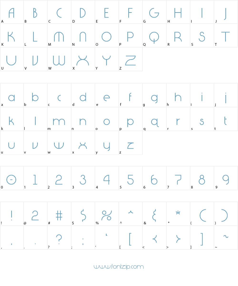
It all started with the letter "Q". I had an idea to create the tail going straight up and down...similar to the "power" symbol on many electronics. Then I thought, "What would the alphabet look like if we couldn't or didn't use diagonal lines?" This is the result...nothing connects, aligns, or cuts unless it is on a multiple of 90° angles. The font ended up having a slight geometric/art deco feel to it.
For commercial use, please visit http://www.essque-productions.com and/or e-mail us to purchase a license.
Download (153.23 KB)
| Files In Archived | |
|---|---|
| 1 | DiagaNO.ttf |
| 2 | webDiagaNO.ttf |
| 3 | EP Free Font License.txt |
| 4 | DiagaNo.jpg |
| 5 | webDiagaNO.css |
| 6 | webDiagaNO.eot |
| 7 | webDiagaNO.woff |
Using DiagaNO font on your website
Customize preview DiagaNO Font
DiagaNO Font Sample Character